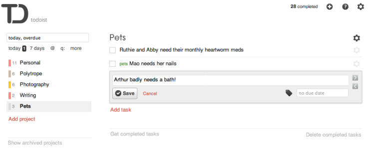
Earlier I overlooked something that I now think is very important: Todoist can show me a single list of all of my current tasks, Reminders can’t. In fact, Todoist can show all open tasks, grouped by project; or all current priority 1 tasks (regardless of project); etc. This makes it mucheasier for me to triage my tasks. Reminders can’t do this.
It also occurred to me that, since Reminders comes with the Mac OS and is free, I can use it for shared projects (like the upcoming wedding of another daughter!) and use Todoist for all my personal tasks, the ones I don’t need to share.
So I’m back to using Todoist for most of my task management. Try it yourself; you might like it.
ADDENDUM a date later (3/6/13): Forget about both this post and the previous one and instead check out Wunderlist2. So long to both Todoist and Reminders!
Apple Reminders is limited not by accident but by design. But it has a couple rather sophisticated features, including location awareness and easy list sharing.
When I get as busy as I’ve been lately, I become a slave to my to-do list software. I’ve used Todoist for a couple of years, but since getting my iPhone 5 recently (and using iOS 6) I had a reason to look at alternatives. In particular, I looked closely at the alternative offered by Apple. Here’s a comparison of Todoist and Apple’s fairly new Reminders app.
Their basic features are pretty similar. Both apps let you create tasks belong to organizational groups (called “projects” in Todoist and “lists” in Reminders). Both apps let you add notes to these tasks. Both apps work on the Mac and the iOS and sync between devices. I’m fond of Todoist’s clean, minimalist look. But Reminders is attractive, too, in a very different way. On the flip side, I am not crazy about the name “Reminders” (as a wedding photographer I think they should have named it “iDo”!), but, come to think of it, I’m not crazy about “Todoist”, either.
So where are they different and which is better for me?
Advantage: Todoist
Todoist is much better at filtering and searching. You can ask it for tasks with deadlines in the next 7 days, and it responds. Can’t do that in Reminders. Apparently Reminders can’t sync with Calendar, something Todoist can do. Is this important? See below.
Todoist also supports labels, which is a way you can get some sort of secondary organization within a project. No labels in Reminders.
Todoist also has excellent reports showing what you’ve accomplished, if that sort of thing matters to you. And finally, I should perhaps mention that Todoist seems to have some connection to the project management software Wedoist, which is made by the same folks at Doist (doist.io). This doesn’t matter to me, but it might to some folks. Apple’s got no project management software.
Advantage: Apple Reminders
Comparing Reminders to Todoist is a good way to see difference between browser-based apps and native apps. It’s much easier to do things like drag a task in a list in Reminders than it is in Todoist.
Todoist’s Mac OS X app doesn’t keep the projects list displayed after you select a project. In Reminders, you can keep the Lists pane visible all the time. I’m not sure how I feel about this. I’d like to be able to see the projects list in Todoist at least some of the time. I’d like it to be an option. On the other hand, making the projects list go away focuses your attention on the active project, and I guess that’s not the worst thing in the world. Slight edge here to Apple’s app.
Let me say a little more about the fact that Reminders can’t sync with Calendar. I asked above, is this important? I think it may not be. If you sync tasks with Calendar, aren’t you just confusing the issue? This really is a problem with all to-do list apps. The point of lists is to list things, so you can tick ’em off as you finish ’em. The point of calendars is to remind you what’s supposed to happen on a certain date and at a certain time. It may be nice to see deadlines on your calendar but they really should be distinct from appointments or events on a fixed date.
Reminders is location sensitive. You can enter a location and, next time you’re there, your iPhone will remind you that a task is due. This is fairly slick. Not sure that I’ll actually use it a lot, but it’s rather cool.
The biggest advantage of Reminders (for me, anyway) is that you can share calendars, easily. I created a “Wedding” calendar and shared it with my wife, so we could both track the stuff that needs to be done before Mary’s wedding in nine days. As far as I can tell, this is just not possible with Todoist — and it’s a fairly big deal.
Of course, there’s also the fact that the Apple app is free. It’s a tough world out there for the third-party developer. Todoist has been around for a while and has had a great product. It has a free version, but the version I’ve got and that I’ve been comparing Reminders to is the Premium version, which costs $30 a year. It’s not that the $30 a year is an unreasonable price — it’s quite reasonable, actually — but, well, free is better than not free, other things being (roughly) equal.
My Conclusion
Although there are a number of things I rather like about Todoist, I’ve decided to stop using it (at least for the time being) and go with Apple’s Reminders. It’s not the price tag. Actually I have already paid for Todoist and my subscription doesn’t end for ten months. But the advantages of Todoist aren’t that important for me: I don’t use labels, don’t very often do interesting searches, and I don’t care about reports. And on the positive side, I rather like that I can share lists from Reminders with my wife easily, through iCloud. Sharing means complete both-ways live editing. She adds a task, I see it on my iCloud devices within seconds, and vice versa. Seems such a small thing, but my wife loves it, and when you’ve said that, you’ve pretty much ended the discussion.
ADDENDUM: I overlooked something important when I wrote this message. See update here.
I made a silhouette today that will end up as a cake topper. (This is for my daughter’s wedding.) Seems there aren’t 400 tutorials on the Internet about this already so I thought I’d write up the steps and share it. It’s pretty easy and fun.
Taking the photo
The idea here is that you want to start with a photo where the contrast between the heads and the background is as dramatic as possible. You could do it when the sun is low on the horizon. But you can also do it in your living room (as I did here). And since you’re going to eliminate everything in the background, you don’t even have to straighten the living room before shooting.
This shot was made in a big hurry—Mary and John were getting ready to leave and they were already late. So I picked a spot that was handy but, in retrospect, maybe not the best possible position for the background, because there was a hallway behind them with a door at the end with panes that became high-contrast problems later on. But that might make this a better example of the things you do in Lightroom.
I used two Sony flash units, on their stands, pointed at the walls behind Mary and John. The flashes were set to be triggered wirelessly. You could however do this with a couple of normal bright lamps. Remember, the goal is to make the background really bright.
I shot with the camera in M mode, using a shutter speed fast enough so I didn’t have to worry about them moving a little, but with the aperture wide open and ISO set high. Remember, we are trying to blow out the background here. My precise settings don’t matter because yours will be different. Note that, even if you never shoot in full manual mode, this is a place where you will want to, because you don’t want a “good” exposure here. You want to grossly overexpose the background and underexpose the person or persons in the foreground.
The most important thing that I did right in this shot was place Mary so that there was nothing in the space between her pony tail and the back of her head. Getting that space empty white to start with saved me some tedious detail work with the adjustment brush later on.
Original photo, after cropping. If I’d had 2 more minutes, I could have handled the lighting better, so the couple in the foreground were much more underexposed, or I could have picked a better place for the shot (so I didn’t end up with that problematic door in the background).
After shooting, import into Lightroom and crop the image appropriately, if it needs cropping.
Lightroom Step 1: Treatment
Convert to grayscale (keyboard shortcut: V). Then set Blacks slider to -100 and Whites slider to +100. If your photo is a good candidate for this project, you should be able to see the silhouette emerging already.
Step 1. Set to grayscale, and set blacks to -100 and whites to +100.
Lightroom Step 2: Contrast
Set Contrast to +100, Highlights to +100, and Shadows to -100. Notice that at this point, you’re over halfway there!
Step 2. Set Contrast and Highlights to +100, and Shadows to -100.
Lightroom Step 3: Background to white
Now we get to the (slightly) hard part.
Select the Adjustment Brush tool (keyboard shortcut: K). Set the “Effect” sliders as follows: Exposure, Contrast, Highlights, Shadows and Sharpness go all the way to the right, while Clarity and Saturation go all the way to the left. Everything else is left in the middle of the slider range. Set the “Brush” sliders thus: Feather, Flow and Density should be all the way to the right. Size and the Auto Mask option are not important just yet. You might want to save this as a slider preset. I named mine “Everything White.”
Now, put a check in the “Auto Mask” check box for the adjustment brush, size the brush appropriately, and carefully brush around the head(s). Make sure that the + marker that shows the hot spot of the brush doesn’t slide into a face. If it does, make a small brush and erase. Type “O” (the letter) to show the brushed area, if you aren’t showing it already. Hold down the Option key on your Mac (Windows: Alt) to turn the brush into an eraser.
It might help during this process to zoom in and make the brush small, for parts of the silhouette that have detail (like mouth, nose, etc.).
Areas of high contrast in the background (like the door at the end of the hallway in my photo) might not go white easily, because the Auto Mask option is turned on and Auto Mask is sensitive to contrast. To whiten these parts of the background, uncheck Auto Mask—but be careful with the brush!
Step 3: Use Adjustment Brush with Auto Mask checked to clear areas close to the silhouettes and with Auto Mask unchecked to clear background areas of high contrast.
Lightroom Step 4: Figures to black
Finally, you may need to darken some areas of the face or body, so get a new adjustment brush, and change the Effect settings as follows: Exposure, Highlights and Shadows go all the way to the left. Everything else stays the same as it was: Contrast and Sharpness stay all the way to the right, and Clarity and Saturation stay all the way to the left. You might want to save this as a slider preset. I named mine “Everything Black.”
Now, using Auto Mask as necessary, paint inside the silhouette area to make everything black.
Finally use a different Adjustment Brush to darken parts of the body that aren’t already all or mostly black. If you’re sending the image to a service to be made into a cake topper (as I am) you don’t need to make the darkening absolutely perfect.
Voilá!
And you’re done! You can print your silhouette, if you like. The plan at the moment for this photo is turn the silhouette into a cutout that can be used as a cake topper. As soon as the bride makes her decision about the cake and we know the diameter of the top layer, I think I’m going to use this gentleman to make the cutout:
Pholium is a nice little app for the iPad that lets you create a virtual book for your photos. My review of version 1.3 was just published at Macworld:
Summary: Serious photo processing is possible on the iPad 2, and you have lots of apps to choose from. I tried two: Photoforge2 and Snapseed. Found Photoforge2 to be a very good app and Snapseed a great one.
Freshness warning: This post was published 8/31/11 and to my knowledge the info in it was correct on that date. But I am quite confident that things will change in the future. You shouldn’t take what I say here too seriously if you read this post while it’s still fresh. Don’t let me do your thinking for you! But if you read it six months or a year later, by all means, skim it quickly, then go find out how the apps I mention here have improved.
The experiment
I don’t generally experiment when people are paying me. I don’t use new equipment at weddings, I don’t (usually) try new techniques when shooting portraits. So when do I try new things? All the time. But my favorite time to learn new things and test new equipment is when I travel. Last year (summer 2010), I found out what happens when I leave my big cameras at home and take only little cameras on vacation. This summer, on my recent trip to the YMCA of the Rockies and next-door Rocky Mountain National Park, I took the big cameras but a little computer, my iPad 2. I wanted to see if I could process my photos on an iPad 2 and get them online while I was traveling. And I wanted the results to be as good.
Software options
Before leaving I investigated the various apps for processing photos on the iPad 2. There are, actually, scores of photography related apps. Many of them are niche products, others are easy to use but don’t have advanced features that I wanted. In the end, I did my editing primarily in two apps: Photoforge2 and Snapseed, and these two apps will be the focus of this article.
I also purchased and briefly played with Filterstorm Pro and Photogene, which should be included if you were making a list of the top photo editing apps for the iPad. But I was put off by the user interfaces in both of these apps. I simply find Photogene’s UI visually unappealing and I thought Filterstorm Pro’s UI was too difficult (perhaps because it’s so idiosyncratic) for me to get familiar with it quickly. Both seem quite capable and I plan to throw myself at Filterstorm Pro again in the near future. But they were not part of this experiment. I would note that both Filterstorm Pro and Photogene actually have better photo management tools than either Photoforge2 or Snapseed.
I also picked up — after I was in Colorado — an app named Flickr Studio. I wanted to upload photos to my Flickr account. The photo editing apps all have an “export to Flickr” option, but it doesn’t work as well as I would like in any of them. In the end, I processed each photo, used the app’s export feature to get the photo to Flickr, and then launched Flickr Studio to complete the entering or editing of metadata like photo titles and tags and the assignment of each photo to a Flickr “set” (an album). I’m not going to say more about Flickr Studio, other than to recommend it highly. If you want to manage your Flickr photo stream from an iPad, Flickr Studio is indispensable.
One more app was critical to my workflow: the iOS’s own Photos app. I’ll say more about this in a minute.
Review and selection: Photos
When I move a batch of photos from the camera to my computer (or my iPad), the first thing I want to do is review them, rejecting and deleting the complete failures, then picking and rating the photos that I want to edit. During this initial review and selection phase, I also add general metadata like keywords (for example, “RMNP” for Rocky Mountain National Park). This part of my workflow is very easy when I’m working on my iMac in Adobe Photoshop Lightroom 3.5. For example, in Lightroom, I can enter keywords for 700 photos in a few seconds.
Unfortunately, I have not yet figured out a way to do it as easily on the iPad. This sort of thing is simply not a strength of either Photoforge2 or Snapseed. I ended up entering most of the metadata (titles and captions as well as keywords) in Flickr Studio, after each image had been uploaded to Flickr. Not really satisfactory. I’m still looking for a tool that will help me here.
Reviewing photos and selecting the ones worth editing was also a challenge on the iPad, using the two apps I decided to do my editing in. Neither Snapseed and Photoforge2 has a browser tool that lets you browse your photo library and see the images at a large enough size to distinguish one from another that looks similar. So my selections had to be made in the iOS’s default photo browsing app, called Photos. After finding and identifying an image in Photos, I would then open it or import it into either Photoforge2 or Snapseed for processing. Also not a very satisfactory solution but this was the best workflow I could come up with.
Snapseed: Pros
Snapseed is from Nik Software, makers of great add-ons for Photoshop and Lightroom. I do not hesitate to say that Snapseed would be my pick as absolutely the best photo editing app for the iPad, if I were picking on the user interface alone. Snapseed was clearly designed from the ground up as a touch-screen app. As a result it’s brilliantly easy to use.
After you open an image for editing in Snapseed, you pick which of a dozen or so categories of tools you want to work with (selective adjustments, tuning, cropping, black and white, film emulation, grunge, frames, etc.). Snapseed can show you a nice large version of your image because it actually hides the UI for selecting a tool. To increase the “ambiance” setting, for example, you actually touch the screen inside the image and a little selection palette appears, showing options such as brightness, ambiance, contrast, and saturation. Drag your finger up or down to choose a tool. When you choose ambiance, the ambiance slider appears down below. Now you drag your finger to the left or right to move the slider. Note that you don’t have to touch any particular area of the screen, that is, you don’t have to place your finger directly on the slider. The app senses up-down and left-right drags on the screen anywhere. Snapseed is much easier to use than any of the other apps not because it eliminates options — it doesn’t — but because it is so perfectly designed for the touchscreen platform.
Another advantage of Snapseed is that you see the entire image as you edit. In Photoforge2, if you are adjusting contrast, a contrast slider widget appears on the screen sitting on top of your photo. If you are particularly interested in the contrast in the area of the photo that the widget has landed on, you’ll have to drag the widget somewhere else. Not so with Snapseed.
Snapseed does not support layers (which frankly strikes me as a very wise decision) but it doesn’t matter much. You can still do selective adjustments of brightness, contrast and saturation using the Selective Adjustment tools, and there’s a Center Focus tool as well. After playing with layers in Photoforge2 (and Filterstorm Pro) I am inclined to think that, if you really need layers, you should be working in Photoshop on a real computer. Since I do 95% of my computer-based post processing in Lightroom, which does not support layers (but does support selective adjustments) I find myself quite happy with Snapseed’s options here.
Another enormous advantage of Snapseed is that it makes it easy to see the difference your edits are making. In every editing screen, your edits are applied as you make them, but before you save them by clicking the Apply button, you can touch the Compare button to see what your photo looked like when you first loaded the current set of tools. Simply not possible in Photoforge2.
I’ll talk about Snapseed’s filters (Grunge, Drama, Vintage Films and Frames) below. Leaving these aside, I would say that, especially if the source photo was reasonably well captured in the first place, I like Snapseed so much I wish that there were a version I could use on my computer.
Snapseed's Selective Adjustment screen
Snapseed: Cons
However, I do have a number of complaints about Snapseed.
Complaint 1. Getting an image into Snapseed is a pain. You have to use a selection dialog that shows the images in your photo library as small thumbnails. Worse, they are sorted with the most recent image files — the ones you almost invariably want to see — at the bottom of the list. Since I have hundreds of images already on my iPad 2, every time I wanted to open an image, I had to scroll to the bottom of a very long list. Photoforge2 uses the same selection dialog and sorts the images the same way, but when you open this dialog, it automatically scrolls to the bottom, which is what I want. This may seem like a small thing until you start editing a lot of images.
Complaint 2. Snapseed is basically useless when it comes to metadata. You can’t add a title, or a caption, or keywords or copyright info or anything else to the file while you work in Snapseed. You can add some of that info when you upload your processed image to Flickr or Facebook. Snapseed is so good that I really wish I could add and save some metadata in files as I’m working on them, so that this info will be there later when I move the files to my computer and import them into my Lightroom 3 catalog.
Complaint 3. Snapseed supports only two photo-sharing web sites: Flickr and Facebook. Your only other output options in Snapseed are email and printing. Photoforge2, by contrast, has all of these options and many more, including sharing to Picasa Web Albums, Twitter, and Tumblr, saving to Dropbox or to an ftp site.
Complaint 4. Snapseed lacks a sharpening tool. It’s not always necessary, especially since I was not shooting raw on this vacation and I had already asked my camera to sharpen images slightly. Still, I wish that Snapseed had this option; Photoforge2 does (as do Filterstorm Pro and Photogene).
Complaint 5. You can’t zoom your image in Snapseed. (Really not a big deal, since I most want to zoom when I’m sharpening, and I can’t sharpen. Still, I’d like to have the option.)
Complaint 6. I can’t add a watermark to images when I upload them.
The first two complaints having to do with file management are my biggest dissatisfactions with Snapseed; the other four are fairly minor.
Photoforge2: Pros
From the beginning of my vacation, I tried processing certain images in different apps. I quickly came to prefer Snapseed, no doubt because it was the easiest of the apps to figure out and the most pleasant to use. But after several days, I started using Photoforge2 as much as Snapseed. I think it was the lack of a sharpening tool in Snapseed that prompted me to use Photoforge2 more often, at least at first. It might also have been that it’s easier to open images in Photoforge2 than in Snapseed, or that exporting to Flickr worked more reliably.
Whatever it was, once you open an image, Photoforge2 provides a fairly rich set of editing tools, to wit: auto (white balance, exposure and enhance); channel mixer; color balance; colorize; curves; levels; brightness/contrast; HSL; exposure; noise reduction; vibrance; USM (amount, radius and threshold); sharpen (simple, for people who don’t understand what to do with the USM options or simply don’t want to bother); shadow/highlight; and white balance. Whew!
In addition, Photoforge2 supports layers. You can create a layer, paint a mask, then use any of the editing tools catalogued in the preceding paragraph to edit the layer. I found it fairly easy to figure out Photoforge2’s layers, even though I’m not very good with layers even on the computer. (I found Filterstorm Pro’s layers much more difficult, indeed I haven’t yet figured them out.) This is potentially a powerful feature and I do not doubt that, for some users, this will be a decisive advantage of Photoforge2 over Snapseed. I however do not care that much about layers, and if an image really requires layered editing, I’m much more likely to do it on my computer in Photoshop than on an iPad. I don’t count the presence of layers as a con in Photoforge, but I do think it’s somewhat superfluous, kind of like getting a windshield for your bicycle.
Photoforge2 has a generally attractive user interface and it does a pretty good job of keeping tools out of the way, at least until you need them. (I mentioned above my little complaint about the way Photoforge2 lays sliders over the image. Given its overall design, I’m afraid it has no choice about this. It has no other place to put the sliders.)
One other area where Photoforge2 has the advantage over Snapseed is that Photoforge2 allows you to view EXIF info (Snapseed doesn’t) and edit metadata such as location (including GPS coordinates), copyright, title and description, etc., and and save this info in the source file.
As I said above, one thing I liked about Photoforge2 was that it let me sharpen my images; Snapseed has no sharpen tool. I found that the basic sharpening tool in Photoforge2 was, if anything, too powerful. I never moved the slider more than a wee bit; going further quickly caused the image to be sharpened too much. I was also fond of one of Photoforge2’s frame options. (More about that below, in my discussion of filters.) Basic file management was easier in Photoforge2, as well. It was easier to open images in the first place; and I had fewer problems uploading to Flickr when I did so from Photoforge2 than from Snapseed (where the uploads failed sometimes and sometimes seemed to fail even though they had not).
Photoforge2's USM tool
Photoforge2: Cons
But of course, I have a number of complaints about Photoforge2, too.
Complaint 1. The accept (√) and reject (x) buttons sit too close to one another in the upper left corner of every screen. You have to be very careful which one you touch and if you have big fingers, as I do, you will eventually reject something you meant to accept or vice versa. In Snapseed, on the other hand, there is a “back” (reject) button on the left and an “accept” button on the right. No risk and no confusion. But this difference is just part of a broader difference between the apps. As I mentioned above, Snapseed lets you make tool adjustments (or tool selections) by dragging almost anywhere on the screen, while Photoforge2 requires greater precision. With Photoforge2, when you are moving a slider, you have to put your finger right on the slider’s grab thingy. Bottom line: Snapseed is perfectly suited to the iPad’s touch screen and Photoforge2 often makes me wish I had a mouse.
Complaint 2. Too many tools. Look at the list of adjustment tools I gave above. Several different tools for exposure, for contrast, for colors, for sharpening. Snapseed has a much smaller selection of tools, but they’re very well chosen. And while Snapseed aims at being an ideal photo editing app for the iPad and very nearly hits a bullseye, Photoforge2 sometimes makes me think its trying to do the impossible, that is, create an iPad version of Adobe Photoshop.
Photoforge2 tool tray
Complaint 3. Compounding the confusion caused by the presence of too many options, there’s the fact that the options are literally duplicated in the UI. That is, the tool selection tray shows the tools over and over again. In the screen capture immediately above, you’ll see that the Frames tool is the current selection (in the center). But look to the left and right sides of the screen: there’s the Frames tool again, on both the left and the right. So the same tool appears three times on the screen. Apparently the idea here is that you can just drag your finger to one direction or the other and the tool you want will eventually appear. But I think this is very bad UI design. It’s not necessary for the toolset shown in the screen capture, which has only five tools, all of which could easily be shown at once. But in the adjustments screen, which has enough tools that they cannot all be shown at once, the “endless buffet” approach means I have to search for a given tool every single time, because I never learn where it’s going to be. Compare this to the way the Mac OS X Dock works. If you have your Dock at the bottom of your computer’s screen, the second icon on the left will always be the second icon on the left; the icon in the middle will always be in the middle; and so on.
Complaint 4. No mid-tone contrast tool like Clarity in Adobe Lightroom 3 (on my iMac) or Ambiance in Snapseed. I’m really torn here. Snapseed has Ambiance and Photoforge2 has sharpening. I would rather have both. But since I only use good lenses and I generally focus carefully, sharpening matters less to me than Ambiance. NOTE: I am sure that you can mimic the “ambiance effect” in Photoforge2 using the curves tool, or levels, or the contrast/brightness slider. But mid-tone contrast is perhaps the adjustment that I apply most commonly, to nearly every image. I’d give up three or four tools in Photoforge2 and some of that precise control, in order to make this adjustment easy to achieve.
Complaint 5. No preview when cropping. No preview at all, come to think of it. No, that’s not quite right. While I want a preview tool when I’m cropping, what I want everywhere else is something like Snapseed’s Compare tool that shows me what the image looked like before the current edit was applied. No can do in Photoforge2.
Complaint 6. Photoforge2’s upload options are much better than Snapseed’s, but it shares with Snapseed one limitation: I can’t add a watermark to images when I upload them.
Aside from that last complaint (which both apps share), the problems I have with Photoforge2 bother me much more than the problems I listed in Snapseed.
Filters
In the paragraphs above, I’ve concentrated on what I regard as the core editing features in Snapseed and Photoforge2. While I suspect that most photographers want to do roughly similar things with their photos with the core editing suite of tools (crop and then tweak color balance, contrast, sharpness), I am aware that different photographers want very different filters, if they want filters at all. Filters are tools for special effects and are, almost by definition, designed to meet special or specialized needs. So, while there is undeniably a large subjective element in my reporting above (for example, I’m not a big fan of layers, so I don’t value them as highly in Photoforge2 as another photographer might), there is even more subjectivity in my valuation of the filter options in these apps.
So I’ll cut to the chase and say that I find many of Snapseed’s filters quite useful, while I find almost none of Photoforge2’s filters useful. Snapseed organizes its filters into five categories: Black & White, Vintage Films, Drama, Grunge and Center Focus. Photoforge2 doesn’t organize them; it simply dumps them all into a tray for special effects. By my count, Photoforge2 has over two dozen effects tools, which sounds impressive until you start asking yourself how often you want to make your photo look like it was run through a blender, captured from a t.v. screen, or shot through night vision goggles. It’s not so easy to count, but I am sure that Snapseed’s better organized tools provide more options and — what is most important — better, more useful options. Color me uncreative if you wish, but I simply don’t want to posterize or pointillize or crystallize my photos, pretty much ever, and if I did, well, I could do that in Photoshop Elements on my computer. The one filter in Photoforge2 that I did find useful — and which as far as I can tell has no counterpart in Snapseed — was the Sepia filter:
Processed in Photoforge2 using the sepia filter
I admit that I don’t see myself using some of Snapseed’s filters, either. The vintage film filters, for example, basically take a good photo taken with a great modern digital camera and make it look like it was shot with a cheap film camera. This is very different from the features in Bibble Pro or Silkypix Pro that mimic the look of specific classic films and developing processes. Those are super geeky but I can appreciate them at least in theory. (Addendum: Nik Software’s Silver Efex Pro 2 — an add-on for Photoshop, Lightroom and/or Aperture — also offers the option of processing to match classic film types.) Anyway, the Drama and Grunge and Center Focus tools in Snapseed are features that I have actually found myself using.
Here’s a mediocre photo of a messy room in my house made slightly less uninteresting by being run through one of Snapseed’s grunge filters:
Processed in Snapseed using a "grunge" filter
This photo of my dog Ruthie uses the center focus filter:
Processed in Snapseed using center focus filter
And here is a photo I took in Rocky Mountain National Park this summer, of Sheeps Meadow as seen from the Old Fall River Road.
Processed in Snapseed
It was a nice enough photo to start with, but it was a total cliché, a photo that every tourist who’s gone up the Old Fall River Road has stopped to take from the same photo-op spot that I chose. I’ve probably taken this photo myself before and it’s not insignificant that I can’t remember. Anyway, I’ll remember this photo. It’s nothing special, but it’s different, and it is a legitimate “treatment.”
These are kind of fun, and I have enjoyed playing with them. I’m not actually wild about the black and white filter options in Snapseed (I’d like to be able to play with color channels), but they are numerous, while Photoforge2 has just one black and white filter with one option (contrast).
Frames
Finally, frames. As part of this vacation experiment, I decided I wanted to put frames on my photos. And I thought, since I was taking photos in a national park, that what Snapseed calls “organic frames” would be appropriate. In this category, I’m prepared to call it a toss-up. Snapseed actually has quite a few more options than Photoforge2 does, but Photoforge2 has a couple options that I really like a lot, like the one I used in this photo of a mountain bluebird hopping around outside our cabin at the YMCA of the Rockies:
Frame added by Photoforge2
I picked this example because it works better with my blog’s (current) black background, but I more often used a white frame.
I prefer Snapseed here, too, because it has more options, but I did like Photoforge well enough that I don’t regard this as a terribly significant distinction between the apps. I would note that Filterstorm Pro doesn’t have these “organic” frame options at all.
The bottom line
I had two goals in this project.
First, I wanted to see if it’s possible to process photos on the iPad 2 in a way that is close enough to professional to make me happy. Now I don’t plan to stop using Lightroom on my iMac, of course. I shot only jpegs on this vacation, while I always shoot raw for my paying customers, and until the iPad apps can handle raw files as well as jpegs, there’s no chance I’ll be processing photos for customers on the iPad. I would also add that the photo management features on the iPad right now are, well, awful. That will discourage me from using the iPad for processing, at least whenever I have more than a couple of photos to deal with. Nevertheless, the answer to this first question is a resounding yes, the iPad can be used for (fairly) serious photographic work. I shoot for newspapers now and then and wouldn’t hesitate to use the iPad for quick processing of news photos, in fact, for that purpose it would do very nicely. It also did a good job of my vacation photos.
The other question was, if I am going to use the iPad to process photos, what are the best apps? I think any of the four apps I mentioned at the start of this article (Photoforge2, Snapseed, Filterstorm Pro and Photogene) could do the job, although as I said, I haven’t yet warmed up to Filterstorm Pro or Photogene.
As for the other two, well, it’s not an easy choice, but not an impossible one for me, either. I like Photoforge2 quite a bit. It is a powerful photo editing app with lots of good tools and I found it reliably stable. I’m glad that I bought it and I will undoubtedly use it in the future. But if I could own just own photo processing app for my iPad 2, it would (right now) be Snapseed. Snapseed does almost everything I want and does it in a way that seems supremely well suited to the iPad. It really is a pleasure to use.
And finally, as they say, your mileage may vary. I am pleased to see that there are not just two but four really terrific photo editing apps for the iPad. And they’re cheap! My advice, at least to serious photographers, is buy ’em all to support future development. If you get to know more than one app well enough, you will undoubtedly find yourself using different apps for different purposes, as I did.


")


")

